At mySidewalk we are always working hard to improve our software and make your life easier. We’re constantly baking up features and enhancements, big and small, and we want to make sure you get them while they’re fresh. The monthly roundup dives into what we’ve been working on for the last month to add even more value to the mySidewalk platform that you know and love.
Last month and every month we’re working to make sure our platform is accessible to everyone and since October is National Disability Awareness Month, we’re getting started with a review of September’s production updates which focused on improving user experiences for better readability and accessibility. Some of the highlights from September are featured below:
Never met a Sans-Serif we didn’t like
If you’ve been keeping up with the mySidewalk blog you know we’ve been talking font recently, but we haven’t just been talking. We’ve also been updating and changing the way we do some of our dashboard fonts. This month we made all the platform links more readable. Now when you turn some of your dashboard text to a link it is automatically underlined and, as a fun bonus, you now have the option to make them bold! This will make it more apparent when there is a link in your text.
An Iconic Improvement
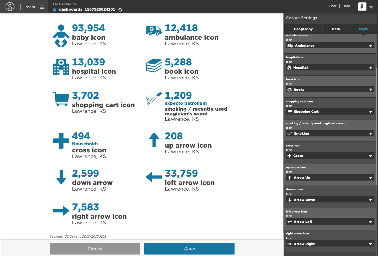
Icons are fun!!! They bring personality and attention to the data we plug into our dashboards. This month we took some time to create new icons in the dashboards for your most iconic data visualizations. Now we have an icon of a baby, an ambulance, a hospital, a book, a smoking cigarette, a shopping cart, a cross, and arrows facing four directions. The possibilities are endless!

Bold, Bright, Mappable
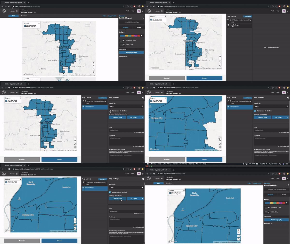
Our maps are officially awesome and by awesome I mean more readable! We improved the map labeling features to increase readability by allowing users to place base map labels either in front or behind data layers. They used to only be behind leaving them to almost disappear behind a dark choropleth map.

We also changed the layer preview map to use Mapbox. This means maps in edit mode are just as easy to read when you’re editing them as they are in the finished dashboard project! We switched from the old-school leaflet map implementation to the new, fresh to death, Mapbox look.
Of course this isn’t all we’ve been up to. In September we also:
-
Updated the Layer Preview page to show the data of the selected feature.
-
Updated the fonts throughout the app.
-
As always, we squished a lot of bugs
Want to learn more about the work we’re doing to make the platform more accessible and how you can help? Check out our Designing for Accessibility Webinar on October 10th!
No Comments Yet
Let us know what you think