At mySidewalk we are always working hard to improve our software and make your life easier. We’re constantly baking up features and enhancements, big and small, and we want to make sure you get them while they’re fresh. The monthly roundup dives into what we’ve been working on for the last month to add even more value to the mySidewalk platform that you know and love.
This month our production team was mainly focused on planning and designing behind the scenes. In August, the biggest changes were in the data available in the mySidewalk data library.
Big Data Moves
In the first week of August, data was added from the current ACS 5-year estimates for 121 variables. You are now able to make more specific breakdowns of the data you already use and love. Most of the data focused on poverty status broken down by different dimensions. For a full list of the data added click here.
On August 22nd we updated the FCC broadband data you already had access to with the 2017 values making your broadband data even more recent. If you were already using this data in your dashboard it automatically updated to reflect the new values.
Last week we added 119 variables from the USDA Economic Research Service (ERS) Food Environment Atlas. These data variables are focused on three broad categories: food choices, health and well-being, and community characteristics. For a more detailed data list, click here.
Dashboard Data Magic Improved
Your dashboard edits and updates probably feel automatic - maybe even magical. In reality there is a whole team of data scientists who look at your data, clean it, process it, and put it into your layers library and dashboard.
But our automation is growing. We’ve made it a priority to teach our computers about the work we do and they’re starting to get it (finally). Now if you have monthly or daily data updates we have algorithms to organize your data and present it in your dashboard way faster than a team of people could. Faster on our end means you’ll be showing off new data to your stakeholders in no time!
Component Updates
As always, we also made improvements to some of the mySidewalk components to make your life easier. This month we’ve focused on design edits that will make your dashboards both more visually compelling and more accurate in the way they represent data.
‘Round and ‘round we go on the carousel of data visualization!
Often in web design we think “this’ll work for now” and then we come to realize that “working for now” isn’t as good as “make it way better.” Welcome to the carousel.
You’ve likely seen our drop down collections and our expandable selections. In these you can combine several maps, charts, or data points and hide them in a stack that allows your viewers to click through. This tool is functionally wonderful as it cleans up the screen and allows things to be categorized and simplified. The only problem is its visibility. I’ll admit - the first time I used a dashboard I didn’t know you could click down to see more. Which is why I present to you (drum roll please) the collection carousel!
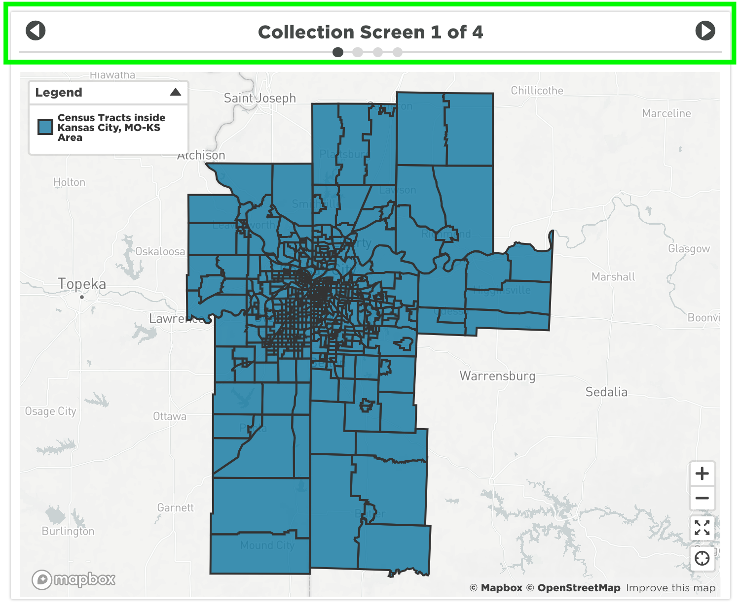
The carousel provides a much more clear indication that there is more to the visualization than what you see at first. This encourages your viewers to click on and see all the charts you built out in your collection. It also helps them keep track of how many visualizations are in a particular collection.
As always, you can still name the collection screen anything you want. AND! You can still do collections the way you used to do them. Welcome to an easy-to-use, option filled future.
Who Doesn’t Like Pie?
Donut charts are a thing of the past - your pie charts are now officially pie charts! Now when we say pie we mean pie and you can count on it. The donut hole has been removed, percentages are shown on charts, and legend items are now displayed on a single line and in a smaller size for a cleaner appearance. Pie charts are now a much better tool for accurate data display.
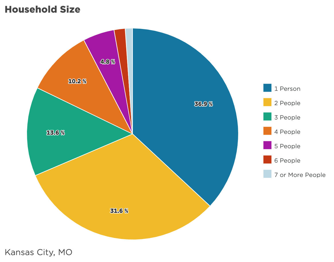
Look at that accuracy!! It’s almost too easy to read. I personally requested we display data with a cobbler, but was told that wouldn’t make any sense. Pie charts are amazing.
Bonus
Of course this isn’t all we’ve been up to. In August we also:
-
Added larger circles on time series to improve the visibility of data points
-
Added hover info to bars, made the default chart size medium, removed spacing between bars in groups
-
Improved the dashboard and dashboard page slug edit to save faster
-
Updated the way data component reference geographies
-
Updated the data swap icon to look less like an “on repeat” button
-
Updated progress tracker default edit state so that buttons are under the table
-
Added a “view report” option that links directly to a report that is saved from a dashboard page
-
As always, we squished a lot of bugs
Share this
You May Also Like
These Related Stories
Release Notes Roundup: September
5 Eye-opening Data Lessons after a Year of Sheltering at Home

Comments (1)